Google Sheets has a real histogram chart type built in, so you can group your data into bins without any add-ons. Here is the standard chart method, the one-click distribution shortcut, and how to control bucket size for clean, readable bars.
This is the most flexible route and gives you full control over the bins and styling.
Type or paste your numbers down a single column, with an optional header in the first cell.
Highlight the data, then open Insert → Chart.
In the Chart editor, on the Setup tab, open Chart type and pick Histogram.
Open the Customize tab, expand Histogram, and set Bucket size for bin width plus the outlier percentile if needed.
Add a chart and axis title under Customize, then use the chart’s three-dot menu to Download as PNG.
For a fast look without making a chart, select your column of numbers and open Data → Column stats. The panel shows a small distribution view alongside the count, average and other summaries — perfect for a quick sanity check before you build the full chart.
The single most important setting is Bucket size, found under Customize → Histogram. It sets how wide each bin is. If your chart looks too blocky, lower the bucket size; if it looks noisy and spiky, raise it. The Outlier percentile option groups extreme values so a few unusual points do not stretch the whole axis.
A handful of issues account for almost every “my histogram looks wrong” question:
If Sheets keeps drawing a column chart, remember the difference: a histogram bins continuous numbers and the bars touch, while a column chart compares labeled categories with gaps between the bars. When your x-axis is a set of numbers grouped into ranges, force the chart type to Histogram in the Setup tab rather than accepting the suggested column chart.
For very skewed data — where most values bunch up and a few are huge — a linear axis can hide the detail. Sheets does not offer a log-scaled histogram axis directly, so a common workaround is to add a helper column with =LN(value) and chart that instead, then label the axis as a log scale.
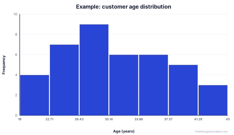
Copy your column out of Sheets and paste it into the maker. It picks sensible bins automatically, shows the mean, median and standard deviation, and lets you download the chart or a CSV frequency table you can paste straight back into Google Sheets.
Bucket size is the width of each bin. A larger bucket size groups more values into each bar and produces fewer, wider bars; a smaller bucket size gives more, narrower bars. Set it under Customize → Histogram → Bucket size.
Yes. Select a column of numbers and open Insert → Chart; Sheets often suggests a histogram automatically. You can also highlight a column and read its quick distribution in the Column stats panel.
Usually the bucket size is left on auto. Set a fixed bucket size to control bin width, and check that your column contains numbers, not text. Removing stray header rows from the selection also helps.
Google Sheets shows counts by default. For a true relative frequency histogram, build a helper column of percentages, or paste your data into our frequency histogram maker and tick relative frequency.
Yes. Google Sheets has a built-in Histogram chart type under Insert → Chart, and a quicker one-click Column stats distribution view under Data → Column stats. Both work on any column of numbers, and both let you set the bucket size from the Customize tab of the chart editor.
Neither Docs nor Slides can build a histogram from raw numbers on their own. Build it in Google Sheets (or in the tool at the top of this page), then paste the chart into Docs or Slides. In Docs, pasting a Sheets chart lets you choose Link to spreadsheet, so edits to the numbers keep the doc in sync.
Insert → Chart → Histogram gives you a full chart you can title, style and export. Data → Column stats shows a quick preview panel with a small distribution, plus count, sum, average and median — no chart to insert, just a look at the data. Use Column stats to spot-check; use the histogram chart when the visual needs to leave the spreadsheet.
The single most-asked question about the Google Sheets histogram chart is how to control the bar width. Google Sheets calls a bin a bucket, and you have full control from the chart editor:
Sheets doesn't expose a "number of buckets" option directly — you set the width and it computes the count. If you want an exact number of bars, work backwards: divide your data range by the bar count you want, and use that as the bucket size. Or paste the column into the tool at the top of this page, which shows the three standard bin-count rules (square-root, Sturges, Rice) side by side and lets you drag a slider.
Too few, chunky bars: reduce the bucket size. Too many, spiky bars: increase it. Bars don't start at 0: Sheets picks its own left edge; there's no built-in override, but tweaking bucket size often re-anchors it. The chart looks empty: your data column probably contains text (headers, blanks, notes). Select only the numeric cells before inserting the chart.
Once your histogram looks right, you rarely want it to live in the spreadsheet. Two ways to move it:
If you're making a histogram for a Google Doc report or a Slides deck and don't need the data live-linked, the tool above exports a publication-ready PNG or vector SVG in one click, and you can drop it straight into Docs with Insert → Image → Upload from computer.