Free online histogram generator

Free Histogram Maker

Turn a list of numbers into a clean histogram in seconds. Paste or upload your data, choose how many bins you want, and download a publication-ready chart — free, no account, no watermark.

100% freeNo sign-upWorks on mobilePNG, SVG & CSVData stays in your browser
Coming back later? Press Ctrl+D (or ⌘+D on Mac) to bookmark this histogram maker.
Histogram generator
commas, spaces or new lines
8
BarsBorder

Recent charts (saved on this device)

Paste your data and press Make histogram. Your chart, summary statistics and a full frequency table appear here.

Generate a chart to see an automatic read of its shape, skewness and a recommended bin count.

Summary statistics

Frequency distribution table

The bin-by-bin frequency table will appear here after you generate a chart.

How to use this tool

  1. Paste, upload or switch modes. Type or paste numbers separated by commas, spaces or new lines, or drop in a .csv / .txt file. Switch to Frequency table mode if your data is already summarised as range, count.
  2. Let Auto pick bins, or take control. Auto uses the square-root rule and works for most sizes. Drag the slider for wider (fewer, chunkier) or narrower (more, spikier) bars, then compare shapes.
  3. Toggle display options. Turn on Relative frequency (%) to switch the Y-axis to percentages, Gridlines for a cleaner read, Show counts to label each bar, or Remove outliers to drop values more than 1.5 × IQR from the box.
  4. Style it. Recolor the bars and their border, and add a chart title plus X- and Y-axis labels so the chart is ready for a report or slide.
  5. Read the shape. The tool prints an automatic shape read — approximately symmetric, right-skewed or left-skewed — plus the skewness value and the three standard bin-count suggestions (square-root, Sturges, Rice) for your sample size.
  6. Download or share. Save the chart as high-resolution PNG, scalable SVG for print, or the frequency table as CSV. Copy a share link that reopens the exact same chart on any device.
Why this tool

A histogram maker that does the statistics too

Most free chart tools stop at the picture. This one gives you the numbers behind it, so you can actually understand your distribution.

Instant and free

Paste numbers and get a histogram right away. No paywall, no trial, and no limit on how many charts you create.

Real statistics

Every chart ships with mean, median, mode, standard deviation, quartiles and a full frequency table — not just bars.

Built for export

Download crisp PNG or vector SVG for reports and slides, or grab the frequency table as CSV for Excel and Sheets.

Frequency or relative frequency

Switch the Y-axis between raw counts and percentages, or feed in a ready-made frequency table for statistics homework.

Tune every detail

Adjust the bin count with a slider, recolor the bars, remove outliers and add axis titles until the chart says exactly what you mean.

Private by design

Your numbers are processed on your device and never uploaded. Recent charts are remembered locally so you can reopen them later.

Step by step

How to make a histogram in 4 steps

From a raw list of numbers to a finished chart, the whole process takes well under a minute.

  1. Add your data

    Type or paste your numbers in the box, separated by commas, spaces or line breaks. You can also upload a CSV or TXT file exported from Excel or Google Sheets.

  2. Choose your bins

    Leave Auto on to let the square-root rule pick a sensible number of bins, or drag the slider to group your data into wider or narrower intervals.

  3. Style the chart

    Switch to relative frequency, toggle gridlines, recolor the bars and add a title and axis labels so the chart is ready for your report.

  4. Download or share

    Save the chart as PNG or SVG, export the frequency table as CSV, or copy a share link that reopens the exact same chart on any device.

Tip: tidy data wins

The maker ignores blanks and non-numeric text automatically, so you can paste a whole spreadsheet column without cleaning it first. If your file has headers or extra columns, only the numeric values are used.

Exporting from Excel? Copy a single column of values, paste it in, and you are ready to go.

Worked example

From raw scores to a finished histogram, step by step

Suppose you have twenty-five exam scores out of 100 for a small class:

78, 82, 91, 65, 88, 74, 92, 85, 79, 88, 71, 95, 83, 77, 89, 80, 86, 72, 90, 81, 84, 93, 76, 87, 82

Paste those numbers into the maker above and leave Auto bins on. With n = 25, the square-root rule suggests √25 = 5 bins. The tool prints all three standard suggestions — square-root (5), Sturges’ rule (6) and the Rice rule (6) — so you can pick with confidence.

The frequency table below the chart lays out what happened, one class per row: 65–71 holds two scores, 71–77 holds four, 77–83 is the tallest class with eight, 83–89 holds seven and 89–95 holds four. The summary panel puts the mean at about 82.7 and the median at 83 — close together, which is your first hint that this distribution is roughly symmetric.

The shape read confirms it: skewness is near zero, so the tool prints "approximately symmetric" and the mean and median are practically the same. If you tick Relative frequency (%), the Y-axis flips from raw counts to percentages: the tallest class becomes 32%, and the whole histogram sums to 100%. Toggle it off, download the PNG, and drop the image into your homework or lab report.

Reading the numbers

How to read skewness and what it means for your data

Skewness measures how lopsided a distribution is. The maker reports it as a signed number and translates it into plain English so you can act on it without a stats textbook open.

Right-skewed (positive skew) means a long tail toward higher values. Household income is the textbook example: most people cluster in a modest range, but a small number of very high earners drag the tail out to the right. The mean sits noticeably above the median because those extreme values pull the average up. Reporting a mean by itself for right-skewed data can be misleading — the median usually tells a truer story about a typical value.

Left-skewed (negative skew) means a long tail toward lower values. Exam scores near a ceiling look like this: if a test was easy for the class, most students bunch up near 100 and a few strugglers pull the tail down. The mean falls below the median, and again the median is often the more honest summary.

Approximately symmetric is the classic bell shape. Heights, measurement errors, and many biological quantities behave this way. Mean and median line up, skewness is near zero, and the mean is a perfectly good summary of the typical value.

The maker prints the numeric skewness alongside the label, so you can distinguish "mildly skewed" from "seriously skewed" — anything with an absolute value under about 0.5 is close to symmetric, 0.5 to 1 is moderate, and above 1 is heavy.

Choosing bins

Bin width vs bin count: how to choose without guessing

The single biggest lever on how a histogram looks is the number of bins, and there are three widely-used rules of thumb that the tool computes for you automatically.

  • Square-root rule. Bin count = √n, rounded up. The default in the maker because it works well across a wide range of sample sizes and is easy to justify. For n = 100, it suggests 10 bins.
  • Sturges’ rule. Bin count = log₂(n) + 1. Slightly conservative — tends to under-bin very small samples and over-bin very large ones. For n = 100, Sturges suggests about 8 bins.
  • Rice rule. Bin count = 2 × n1/3. Aggressive; produces more, narrower bins as n grows. Good when you have a lot of data and want to see fine detail. For n = 100, Rice suggests about 10 bins; for n = 1000, it suggests 20.

None of the three is objectively right. Too few bins hide detail — the distribution looks blocky and any interesting features get smoothed away. Too many bins add noise — every random blip becomes a bar and the eye can't see the shape for the spikes. A useful habit is to try two or three bin counts before settling on the chart you publish; the maker's slider re-renders instantly, so the cost of trying is nothing.

If you are working in Google Sheets, the same question comes up as "how do I change the bucket size?" — a dedicated section on that page walks through it. The vocabulary is different, the choice is the same.

The basics

What is a histogram?

A histogram is a chart that shows how a set of numbers is distributed. The range of values is split into consecutive intervals called bins, and the height of each bar shows how many data points fall inside that interval. Because the bars sit directly next to each other, a histogram makes the overall shape of your data obvious at a glance — where values cluster, how spread out they are, and whether the distribution is symmetric or lopsided.
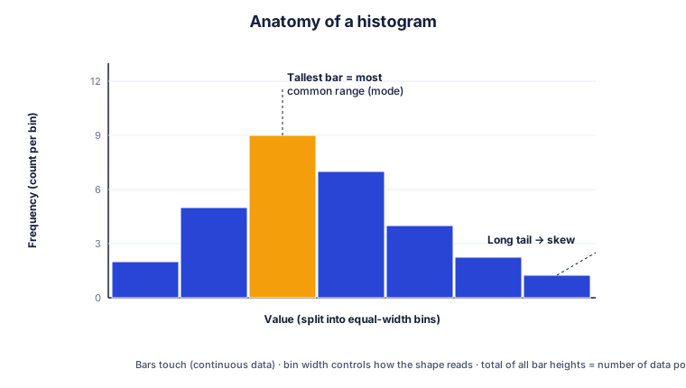
Labeled diagram of a histogram showing bins on the x-axis, frequency on the y-axis, the tallest bar as the mode, and a long tail indicating skew
A histogram splits values into equal-width bins; bar height is the count in each bin.

Histogram vs bar chart

It is easy to confuse a histogram with a bar chart, but they answer different questions. A bar chart compares separate categories — sales by country, votes by candidate — and the bars usually have gaps between them. A histogram works with continuous numeric data, the bars touch, and the order of the bars is fixed because the x-axis is a number line. If your x-axis is made of labels, you want a bar chart; if it is made of numbers grouped into ranges, you want a histogram.

How to choose the number of bins

The number of bins changes the story a histogram tells. Too few bins hide detail and the chart looks blocky; too many bins create a noisy, spiky shape. A common starting point is the square-root rule — take the square root of the number of data points and round up. Sturges’ rule (log₂n + 1) and the Rice rule (2 × n^(1/3)) are popular alternatives. This maker shows all three suggestions for your dataset so you can compare and pick whichever reads best.

Reading the shape of a distribution

Once your histogram is drawn, look at its silhouette. A roughly symmetric, bell-shaped curve points to a normal distribution. A long tail to the right is right-skewed, which is common for income or waiting times, while a long tail to the left is left-skewed. Two separate peaks suggest your data may be a mix of two groups. The maker measures skewness automatically and tells you what the shape implies, along with where the mean sits relative to the median.

When not to use a histogram

Histograms are powerful but not perfect. The same data can look very different depending on bin width, they hide the exact values inside each bar, and they struggle with very small samples. For tiny datasets a dot plot or stem-and-leaf plot can be clearer, and for comparing several groups side by side a box plot often works better. A good habit is to try two or three bin counts before settling on the chart you publish.

Where they are used

Who makes histograms, and why

Education & statistics homework

Students summarize exam scores, plot frequency distributions and complete assignments — whether the class uses a TI-84 calculator, SPSS or a free online maker like this one.

Business & analytics

Teams look at customer ages, order values, delivery times and response times to spot where most activity happens and where the outliers hide.

Science & research

Researchers show measurement distributions, lab results and particle sizes, or overlay flow-cytometry data in specialist tools such as FlowJo.

Quality control

Manufacturers check whether a process stays within tolerance, using the shape of the histogram to catch drift before it becomes a defect.

Step-by-step guides

How to make a histogram in any tool

Prefer to build it yourself in software you already use? These guides walk through every step, with the exact menus and code.

FAQ

Histogram maker questions, answered

Is this histogram maker really free?

Yes. Free Histogram Maker is completely free with no account, no trial and no watermark. You can build as many histograms as you like and download every one of them.

Do I need to install anything?

No. The tool runs entirely in your web browser, so it works on Windows, Mac, Chromebook, iPhone and Android without any download or plugin.

How do I make a histogram from a frequency table?

Switch the input mode to Frequency table, then enter one class per line as range, count — for example 10-20, 8. The maker turns those counts straight into bars. See the dedicated frequency histogram maker guide for more.

What is the difference between a frequency and a relative frequency histogram?

A frequency histogram shows raw counts on the Y-axis. A relative frequency histogram shows each bin as a percentage of the total. Tick Relative frequency (%) to switch between them instantly.

How many bins should a histogram have?

A good starting point is the square-root rule: take the square root of the number of data points and round up. Sturges' rule and the Rice rule are common alternatives. The tool shows all three suggestions for your dataset and lets you fine-tune with a slider.

Is my data uploaded to a server?

No. Your numbers are processed on your own device and are never sent anywhere. Recent charts are stored locally in your browser so you can reopen them next time, and you can clear them with one click.

Can I download the histogram for a report or slides?

Yes. Export a high-resolution PNG, a scalable SVG for print, or the frequency table as CSV to drop into Excel or Google Sheets.

Can I make a histogram on my phone?

Absolutely. The layout is mobile-first, so the data box, controls and chart all work comfortably on a small screen.

Common uses

What people use it for

A few of the everyday jobs this histogram maker is built to handle.

Statistics homework

Paste a set of exam scores or survey results, get the mean, median and standard deviation, and download a labeled chart for your assignment.

Lab & research reports

Turn measurements into a clean distribution, read the skewness automatically, and export the frequency table as CSV straight into your write-up.

Quick data checks

Drop in a column of numbers on your phone or laptop to see the shape of the data and spot outliers before any deeper analysis.